These artist’s notes are copyright to Graham Baker and may not be shared or copied without permission. Any enquiries, please email to grahambaker@gmail.com.
Oil painting on canvas. 48x36 inches. 120cm x 90cm
I silhouetted this flower to highlight the exquisite beauty of the Apple Blossom. Within a week it falls to the ground and dies. Paintings such as this, remind us of the transience of life and the important part Art plays in capturing these moments.
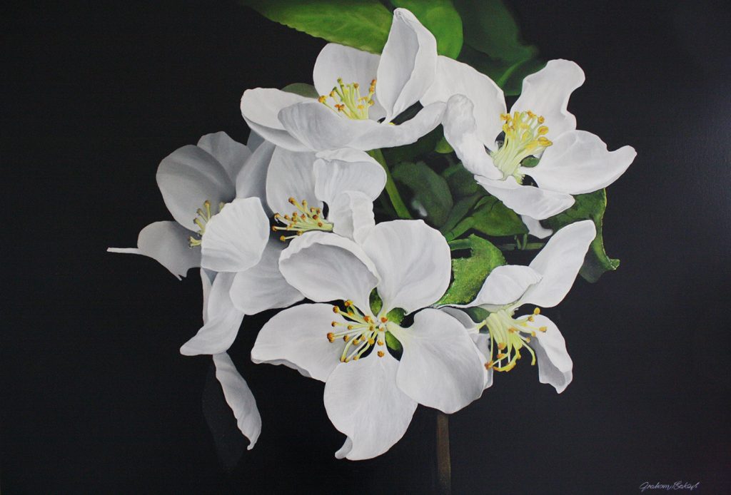
In this painting I used an overhead projector to set the flower out directly onto canvas. This way I could move the projector back and forth until I had the image in the exact place and size I wanted it. Also I could judge how much space I needed around the petals, for balance.
When drawing any layout our attention needs to be on lines and shapes, it has to be simple. There is only so much detailing we need at this stage. When painting, our focus is on colour and form, the layout and unnecessary details are lost under layers of paint.
With Overhead projectors all we get are the proportions and some basic shapes and lines. OK for landscapes but it is too difficult to delineate much of the detail on something as delicate as this flower, with its subtle colours and blends. For more experienced artists a less detailed pencil layout is enough.
I started painting the big shapes first, the petals, with Titanium white ( for excellent coverage). Then mixed the lightest tone of grey for the softest shadows and shading. I could hardly see them. By starting so light I could easily control the build up of tonal strength, sneaking along, gaining confidence as I applied layer after layer.
The white was applied wet. That gave me plenty of time for tonal blending. I used my softest brushes, with a mix to help hold their shape. Usually sable/ox. There is nothing wrong with the synthetic soft brushes.
My mix is 50% Linseed oil plus 50% turps for my medium for oil paintings. If I want to slow down the drying time for blending etc.I use a little more oil than turps in the mix. If I want to speed the drying for bashing on backgrounds etc.I add a little more turps than oil in the mix.
If you are using Acrylic paints, slow the drying down with a medium designed for that purpose. There are plenty of retarders on the art suppliers shelves. I use Resene ‘Acrylic Hot Weather Additive’. It gives me better control with colour and drying time and allows me to borrow some of the oil painters techniques.
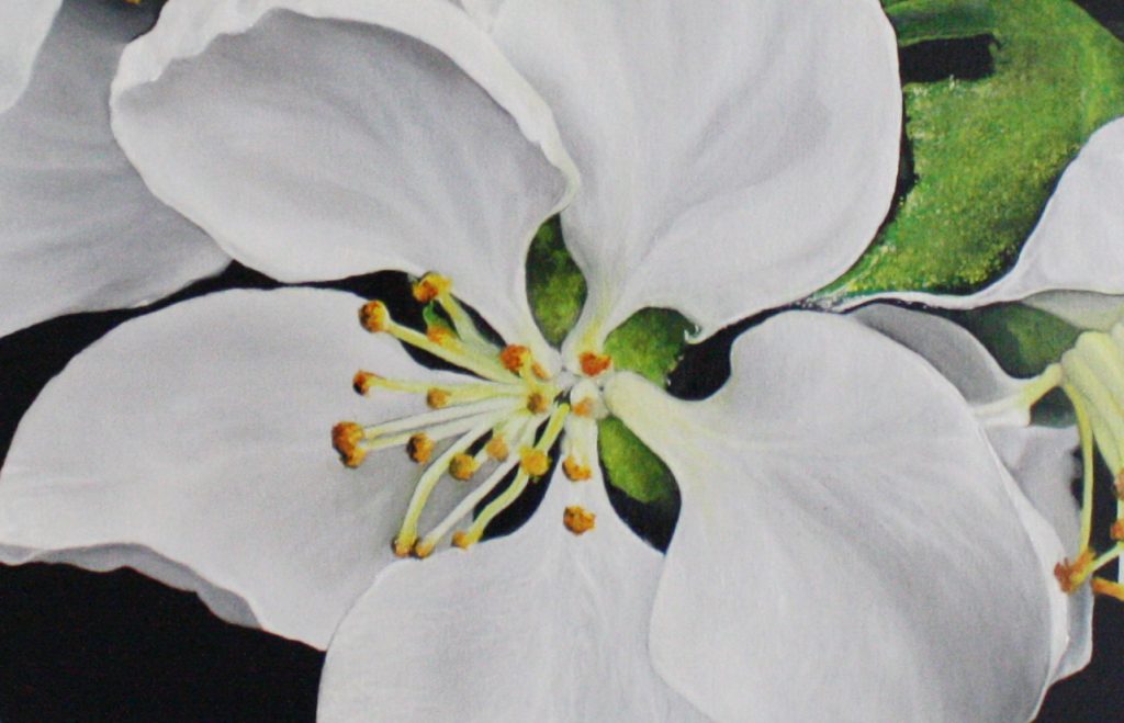
I wanted to lead the viewer’s eye around the flowers and eventually come to rest on the reproductive area. I continued refining that part of the painting until I was happy or felt I couldn’t improve it anymore. After each layer I would take a few steps back and assess my progress to make sure I hadn’t overworked it. If I had I would simply start again while the paint was wet.
I have not detailed everything, only the focal element. Neither have I let lines dominate in this painting. Instead I have built up contrasts of tone, depth and colour by overpainting. The flower is soft, in complete contrast to the background with its hard edges. Also I threw in a little bit of texture which is abstract yet looks real. When realism and abstract are mixed the results are stunning.
Generally it is better to paint flowers in their natural habitat. The contrast between the flower and the background was intentional, giving the painting a more decorative feel. Each element is balanced, in harmony, yet contrasts with its neighbour giving the whole image a fresh, clean look. Qualities that are essential in paintings of flowers.
These artist’s notes are copyright to Graham Baker and may not be shared or copied without permission. Any enquiries, please email to grahambaker@gmail.com.